Choose your country

Pulldown 2
Pulldown 2
Pulldown 2
Pulldown 2
Pulldown 2
Pulldown 2
Pulldown 2
Pulldown 2
Pulldown 2

DEMENTIA DESIGN AND HEALTH

listed below are the most frequently asked questions about our Dementia friendly principles. If you would like further information, please visit our Designing for Dementia pages click here


Does dementia friendly flooring exist or is it specific to the individual person with dementia?

Does dementia friendly flooring exist or is it specific to the individual person with dementia?

Dementia presents differently in each person but the evidence suggests there are common attributes in relation to floor design which helps or are of benefit to most. Therefore 'dementia-friendly' flooring is flooring which omits the common design features which have been identified through research as having a negative impact on most.

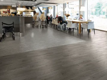
Eternal Aged Care Dining Room

If considering tonal contrasts in adjacent areas, should we be using tones with a similar LRV? If yes, why can't contrasting colours be used?

If considering tonal contrasts in adjacent areas, should we be using tones with a similar LRV? If yes, why can't contrasting colours be used?

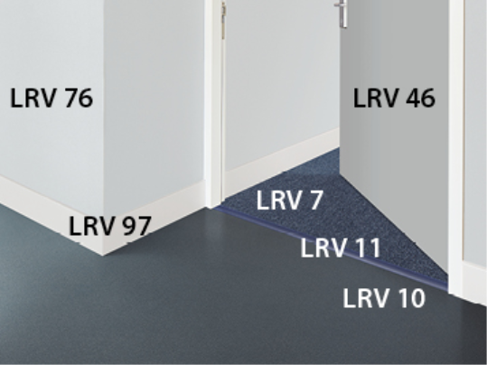
Flooring in adjacent areas should at all times be tonally similar/provide tonal continuity of no more than 10 degrees of light reflectance value. Where tonal contrast is present which is greater than 10 degrees of light reflectance value there is a greater likelihood of the person with dementia perceiving a step (and high-stepping) thus increasing the risk of falls, or misinterpreting the flooring which can lead to confusion or can be perceived as a barrier thus reducing movement.

What is the maximum % in LRV terms that should be used as a contrast, and how does that translate in terms of colour?

What is the maximum % in LRV terms that should be used as a contrast, and how does that translate in terms of colour?

The maximum permitable % change in tones for adjacent floors is 10 units of LRV. This is a numerical figure which represents 'tone'. This does not represent 'hue' or 'saturation' values of a colour and therefore when considering contrast, it is the tone which is relevant. This is supported in the BS8300: 2009 Accessible Standard.

Dementia LRV

Are flecked, striped or patterned products suitable for use? If not, why not?

Flecked, striped and patterned flooring is not recommended for use in a dementia-friendly environment. These types of design are attributed to increasing visual stimulus; creating confusion; and can be perceived as changes in level.

What makes a certain design or colour of flooring look like water & why can't I use these?

Highly reflective or sparkly flooring is most likely to be perceived as water and therefore we recommend matte floor finishes and flooring without a speckle or sparkle.

Can I use wood plank effect flooring? Does it matter if it it’s dark coloured or light coloured wood? Does it have to be sheet or can it be tile?

This is specific to the individual product and therefore we refer you to the accreditation rating of each product.

Are lighter pastel colours better to use than dark colours? What about bright, stronger colours like reds or yellows? Can we use black? Should we use colours used in Nature? Are warmer colours better than blue/grey tones?

The DSDC product accreditation includes both dark, mid and light tones and the guidance in relation to how to make these more dementia-friendly is provided in the Do's and Don'ts technical literature.
Do's and Don't design guidelines

Can contrasting colours be used for ‘way finding’?

People with dementia experience a range of changes that can make wayfinding difficult, including spatial disorientation, related to spatial misperceptions; memory problems that make it difficult for people to remember where they are going; and problems with spatial and depth perception.

These can make it difficult for people to get around, go where they wish to, and find their way back again. Colours, can be used for wayfinding but we discourage the use of contrasting colours on the floor for wayfinding.

Should different colours be used for different areas of use?

Normal age related changes in the eye can make colour discrimination more difficult. Therefore, we don't recommend the use of different colours for different areas where this is intended to support the person with dementia to wayfind; the effectiveness is likely to be less on the person with dementia owing to the reduction in colour discrimination.

Where the design encourages more colours, the tonal contrast must be considered & carefully mapped to avoid increasing risk of falls where the contrast between adjoining floors is too great.

There is thinking in some arenas that actually highly patterned Carpets can provide nostalgic stimulus for some patients (to their benefit). Is that true?

The evidence is weighted to suggest that this is not the case and weighted to support the case for non-patterned flooring. Highly patterned carpets can create too much visual stimulus & agitation; be perceived as a barrier thus reducing movement, or in some instances impact on visual illusions or hallucinations.

Do you have any domestic looking carpet tiles suitable for use?

In general, an impervious broadloom carpet is recommended for use in a dementia environment. However, in some circumstances, carpet tiles can be used but with caution.

How can some safety ranges be approved for use and others not when they use the same slip resistance particles? How we can I reassure customers it isn’t ‘too sparkly’?

The effect of sparkle on the eye varies dependent upon the individual sample and colourway. DSDC reviewed each sample on an individual basis and a peer-review assessment was made.

Therefore some samples (where the speckle is low) can be used, whereby others (where the contrast increases the effect of the speckle) are not suitable for use.

Are surface embossed products suitable for use?

This is specific to the individual product and therefore we refer you to the accreditation rating of each product.
pelase click here to view dementia accredited product selector

Should all flooring be at the same level?

Where there is not an intended change in level (stairs for example) flooring should be at the same level; even a 15mm projecting threshold strip can present a trip hazard to an elderly person.

How should entrance matting be incorporated into designs? Does dark matting appear as a black hole to dementia sufferers?

Entrance matting should be designed in the same manner as any other adjacent floor. It should match tonally with the adjoining floor finishes. Dark matting is, therefore, a concern and can be perceived as a hole if the flooring on which it sits or is adjacent to, presents too much of a contrast. Where the dark matting is adjacent to an equally dark floor, it is unlikely this will be seen and perceived as a hole.

What furniture/soft furnishing colours do you need to consider v’s the flooring?

Flooring design needs to also consider the contrast between the wall and the floor (which should be more than 30 units of LRV) and the upholstery (which should also contrast).
Increasing contrast between the wall and the floors can help the person with dementia better interpret the 3d aspects of the environment and aid movement and wayfinding.

Providing contrast between the upholstery and the flooring can help the person with dementia to accurately see the seat and position themselves accurately over it, thus reducing the likelihood of falling off. We also recommend that worktops/table tops contrast with the floor to aid placement of objects some of which can be a hazard such a hot drink.

How does ‘2’, use with caution work in practice?

The DSDC product accreditation is a standardised method of identifying suitability of the product for use in an environment by a person with dementia. The classification '2' recognises that people with dementia are users of a variety of building types (cafe's, theatres, shops and medical environments) and therefore the products within this range are identified as for 'use with caution' due to the pattern or tonal contrast of the surface of the product.

In all cases, specifiers should consider the intended use of the floor, frequency of use by a person with dementia and the needs of the client. If in doubt, ask.

Why is there at times ‘contradictory’ information in the marketplace?

The DSDC product accreditation is based on academic research. Where there are contradictory positions in the marketplace, we recommend identifying the source of the research which underpins the contradictory position and discusses this further with the manufacturer or research institute for further guidance.

Should transition strips be used? Should transition strips be the same colour?

Transitional strips should be used only where absolutely necessary. Where transitional strips are required they should match tonally (or be within 10 units of LRV) of adjacent floor finishes.