Pantone Color of the Year 2021

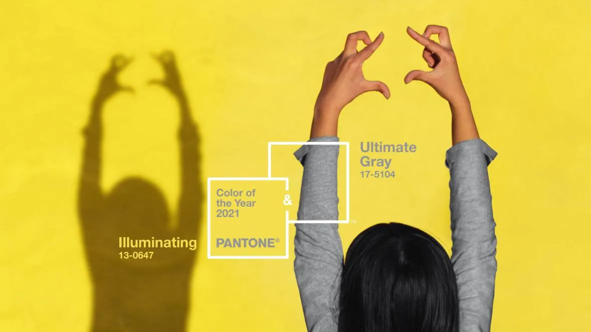
At the end of 2020, Pantone announced its Color of the Year 2021. And surprisingly, there are two colours instead of one this year. We asked two of our designers about their thoughts on the newest Pantone Color of the Year.
For over 20 years, Pantone’s Color of the Year has influenced product development and purchasing decisions in multiple industries, including fashion, home furnishings, and industrial design, as well as product packaging and graphic design.
The selection process requires thoughtful consideration and trend analysis. To arrive at the selection each year, Pantone’s colour experts at Pantone Color Institute comb the world looking for new colour influences.
This can include the entertainment industry and films in production, traveling art collections and new artists, fashion, all areas of design, popular travel destinations, as well as socio-economic conditions. Influences may also stem from new technologies, materials, textures, and effects that impact colour, relevant social media platforms and even upcoming events that capture worldwide attention.
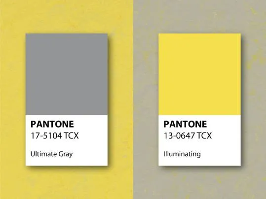
In December 2020, Pantone announced the new Pantone Color of the Year 2021: PANTONE 17-5104 Ultimate Gray and PANTONE 13-0647 Illuminating. These two independent colours that highlight how different elements come together to support one another, best express the mood for Pantone Color of the Year 2021, as Pantone explains. “Practical and rock solid but at the same time warming and optimistic, the union of Pantone’s Ultimate Gray and Illuminating is one of strength and positivity. It is a story of colour that encapsulates deeper feelings of thoughtfulness with the promise of something sunny and friendly.”
As Pantone describes it, Illuminating is a bright and cheerful yellow sparkling with vivacity, a warming yellow shade imbued with solar power. Ultimate Gray is emblematic of solid and dependable elements that are everlasting and provide a firm foundation.

“The Union of an enduring Ultimate Gray with the vibrant yellow Illuminating expresses a message of positivity supported by fortitude. Practical and rock solid but at the same time warming and optimistic, this is a colour combination that gives us resilience and hope. We need to feel encouraged and uplifted; this is essential to the human spirit.”
Leatrice Eiseman, Executive Director of the Pantone Color Institute

“For a designer working at Forbo Flooring Systems, it is always important to think ahead when it comes to the use of colour in new collections,” Thomas Eurlings, Senior Designer Vinyl at Forbo Flooring Systems, explains. “As a designer, colour and trend research is something you are constantly working on. When Pantone presented their Color of the Year 2021, we were delighted to see that both colours are already very present in several of our recent collections.”
“As Pantone explains, these colours are a great combination to set the mood in any room, adding a dose of sunshine and positivity. Mixing yellow and gray in pillows, tabletops and other accessories infuses vitality and liveliness. The ideal combination for any office, whether in the home or in a commercial space, with the grey providing the firm foundation for the vibrant yellow that heightens awareness and enhances intellectual curiosity, originality, and resourcefulness,” says Thomas.
A beautiful example of solid grey combined with a bright yellow is the 3733 | yellow shimmer in our Marmoleum Concrete collection. The base colour of this item is a beautiful grey tone in which yellow “shimmers” brighten the overall appearance of the floor. The 3471 | yellow glow is a more uni-coloured yellow that matches these shimmers perfectly. These two colours can be easily combined in interiors to create an illuminating ambiance.
“The 40522 | lemon in the Eternal Color collection is another design that connects to the colour of the year,” says Thomas. “This product has a coloured wear layer with tiny sparkles mixed into it. This sparkle gives the floor an almost luminescent quality. When juxtaposed with the 12752 | grey cement from the Eternal Material collection it stands out even more.”
.webp)
.webp)
.webp)
Margareth van Aken, Head of Design Vinyl, was involved in designing the new Sarlon | Modul’up collections. She also sees a perfect match between the Pantone Color of the Year and these new and exciting vinyl flooring collections that will be launched soon.
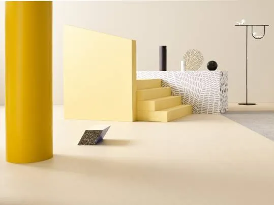
Margareth: “It’s wonderful to see that both collections connect so well with the yellow and grey colour trend of Pantone. Yellow is a positive, popping colour and can actively stimulate people. It also gives a boost to the interior and works well with soft neutrals. In this collection, the yellow colour can be found as a strong tinted wear uni, a fresh yellow canyon and a beautiful yellow doodle. Perfect to combine with grey; from the new steel grey topography, light grey nairobi textile print and the silver slabstone, to the new silver stardust, the natural terrazzo and the grey graphito in our new Sarlon | Modul'up collections. Hence the tagline “Diversity, better together”.”
.webp)
.webp)
.webp)