Beautiful and easy to maintain
Fresh appearance, trendy look, extremely strong, and easy to combine.
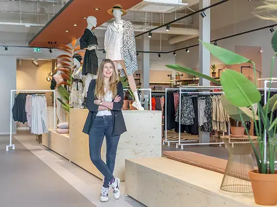
Lotte Helmig, interior designer and founder of Your TailorMate, takes us through the design process of the new store design for the flagship store of fashion chain Norah in Lisse from start to finish. In just four months, she completed this challenge with full enthusiasm and made it a great success.
"With more than 90 Norah clothing stores in mind, the new store in Lisse was planned as the flagship store that should have an innovative and fresh look", Lotte explains. "The design was therefore allowed to deviate from the familiar look of the existing stores. The aim was to give Norah's current customer base a recognisable feeling while also broadening the target group. The emphasis could certainly be more on a trendy look with a kind of concept store experience."
The Norah brand is known for its strong "girlfriend look". Communication is always personal. From airy dresses to trendy skirts and unique pieces, the collection offers variety every week. "When designing the store, you have to take all these aspects into account," says Lotte. "The design must comply with several basic principles, such as the walking routes, the location of the cash register, and the changing rooms.
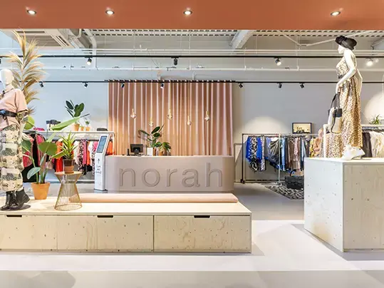
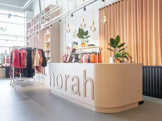
Thanks to my years of experience, I know the basic rules exactly and was able to give valuable advice to Norah. For example, you never place the cash register on the right side. People look to the right as soon as they enter the store, and they immediately want to see something attractive. That's why you hang your most beautiful collections on the right side. The ultimate goal is for customers to view your full range and go further into the store."
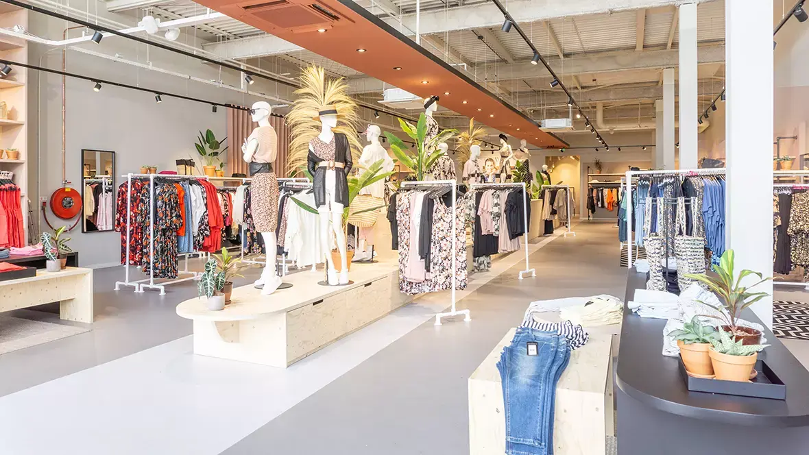
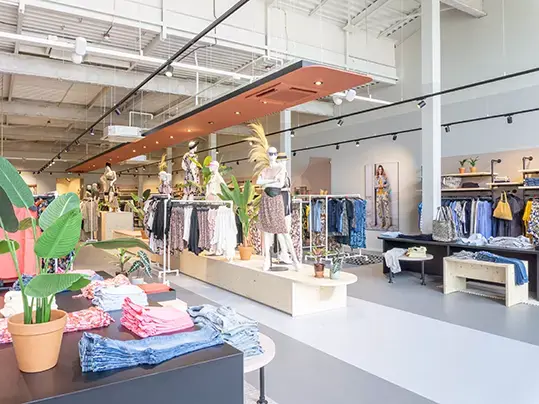
That is also why I opted for a spacious catwalk that runs all the way to the back and therefore connects the entire store. The latest collections are shown on this catwalk; there are clothing racks, and an army of mannequins is set up. The catwalk ends in a bar where visitors can enjoy a cup of coffee. For the floor, I decided to use Marmoleum. "This is a durable floor that is easy to maintain and retains its beautiful appearance.
Plus, it's a climate positive floor covering. Sustainability and quality play an important role in the clothing at Norah, and I also wanted to reflect that in the store appearance. Moreover, I had a wide range of colours to choose from. Because I wanted to keep the base in neutral tones, I chose the Marmoleum Solid Concrete collection. Light grey (Stella) for the general furnishings and dark grey (Satellite) on the catwalk itself. In addition, Marmoleum lasts a long time and is extremely strong. That is necessary; after all, a lot of customers come through our doors."

Marmoleum Concrete 3704 Satellite

Marmoleum Concrete 3730 Stella
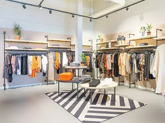
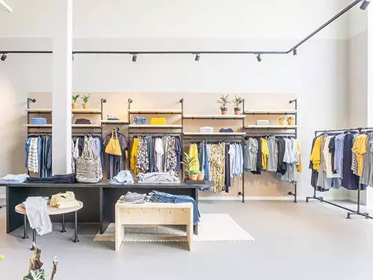
Different colour themes on the walls ensure that the clothing stands out optimally. Lotte emphasises: "When decorating a store, I deliberately choose attractive basic colours. Since the colours of clothing vary depending on the season and trends, it is important that the new clothing always matches the store colours. When selecting, I took colour samples and kept them in the warehouse with all the colours of clothing. This is how I arrived at the perfect shades. And it always fits with a new collection.
The Norah flagship store in Lisse is quite large. "Because of the generous dimensions, I deliberately opted for large elements," Lotte explains. "Although it is a spacious location, the catwalk and the colour themes offer a very structured impression. That is why I chose to have one large closet built, filled with clothing. This also serves as a striking statement: mannequins, along with life-size visuals and decorative items that are also for sale in the store. The large-scale approach creates a Wow feeling in this space and, at the same time, a sense of peace and overview."
Lotte was given 'carte blanche' to work for Norah, and her efforts resulted in a successful outcome. "My design reflects exactly how I had in mind that the Norah brand should present itself," says Lotte. "The goal was to make current customers feel at ease and, at the same time, create an inviting atmosphere for a wider audience. A trend we often see in interior designs for private individuals is that indoor and outdoor living should form one whole.
Outside becomes inside, and inside becomes outside. I have also incorporated this concept into this vision. When you walk past the store and look at the window, you immediately get an idea of what it looks like inside. This has worked extremely well. The number of visitors to the flagship store in Lisse has increased significantly. In short, mission accomplished! After evaluating this store, Norah decided to expand this concept to all their locations. I couldn't wish for a better compliment."
Design and Project Management: Your TailorMate
Complete Build: Building Retail
Flooring installer: Nova Project
Photos: Stek Magazine - Julia Gentaan