Tyler Sharp
ArchIdea 66 Interview
October 2022
.webp)
The architecture of the libraries designed by Tyler Sharp of RDHA takes a background position. It is the activities within the programme that take centre stage.
“I like things to be simple, but not simplistic.”
Photos: RDHA,
Tom Arban Photography
The beginning of Canadian architect Tyler Sharp’s career was atypical.
Instead of founding his own office or joining an established design office, he opted to work for RDHA, a Toronto based studio. The firm was not particularly well known for producing progressive architecture. So why did he decide to join it? “RDHA is one of the oldest ongoing architectural practices in Canada, if not the oldest”, he explained in a video meeting. “Over the years the firm has undertaken a wide variety of projects, achieving a reasonable level of quality, and finishing on time and on budget. In 2005 I was asked to join the firm and help transform the practice into a studio that strived to achieve architecture of the highest calibre. It was practically unique, especially for a young architect, for the existing partners to give me a significant amount of freedom to help rebrand the office. The aim was to develop a new architectural approach and language for the work. This new language was integrated into my first project, the Bloor Gladstone Library, a significant and complex community branch library in Toronto. Besides bringing design skill, I was asked to redesign the website, rebrand the firm’s documents and office space, and help hire new staff. Hiring included promoting the appointment of my partner, a friend and former fellow student Geoffrey Miller.”
Can you describe the new design language that you developed for RDHA?
“The language has continuously evolved over the years, but in essence it is a design approach for producing clear and legible public architecture. And public architecture is what RDHA does first and foremost.” “The first principle of the process is to develop a clear, conceptual approach for the project. That may seem an obvious step to take, but architectural projects often lack conceptual clarity and focus. By a clear concept, I mean the development of an intellectual idea that governs choices through the design process. It can be based on a metaphor, on function or on characteristics of the site, or on all of these parameters. This concept is crucial to the ability to regulate the decision making and direction through all phases of the design process. “The second principle is to create a legible, easily understood architecture. This is especially important for a work of publicly accessible architecture: the building and its organisation should be easily understood by the public, in an intuitive way.”
When you say legible, do you mean it is easy to move through the space and find your way, even without signs?
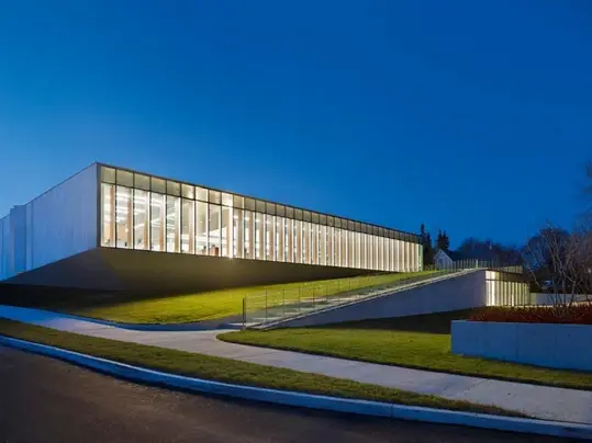
“Yes, the aim is largely to create clear sight lines, open plans, efficient planning and a logical Library might have an austere quality that relates closely to the first principle, the development of a clear concept for a building. In the case of the Waterdown Library, this concept is related to its location on the Niagara escarpment, a large geological landform that is comprised primarily of dolomitic limestone. The library may be seen as an extension of that landform. It is a single-story building, wrapped in transparency and limestone, which exists on six different levels. It is a built topography that you have to climb in order to reach different parts of the programme, as a landscape in own right"
Photo: RDHA photography

.webp)
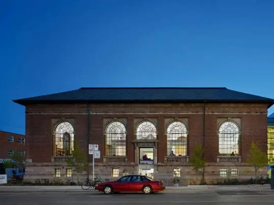
Bloor/Gladstone District Library, Toronto, Canada (2009)

Photos: Tom Arban Photography
The portfolio of RDHA consists mainly of libraries.
What are the challenges of designing a library
nowadays?
“We actually have quite a broad portfolio consisting of various public building types. However, libraries are the largest part of my practice, and they are the most widely published of our project types. One of the exciting aspects of working on public libraries is that the clients have been very open to new ideas and changes relative to the library program typology. When I designed the Bloor Gladstone Library, the clients were just starting to think about the evolution from libraries as containers for books to public spaces for digital collections and new technology-based programmes. Book collections were reducing in size at the same time as technology-based programs were increasing, freeing up new open space within the buildings."So the question arose about how libraries should utilize these
new spaces. One response to this programmatic question was to develop the notion of the ‘maker space’. In essence, that is a public studio space where people can use a variety of technology-based and manual tools for making things. This new program is an interesting addition to what a library used to be, and it creates an information and content cycle within the library; a place to read and learn, a place to make and produce things, a place to store and exhibit, and, more recently, a place for performance.” Is it difficult to design a program that will continue to change over time? “It certainly is. Ten years ago, it was thought that all book collections might be stored away from the public and that there would automated systems to access and deliver books on request. Instead of shelving book collections, public libraries would become purely public gathering spaces, studio spaces, performance spaces and exhibition spaces.
However, libraries were not ready to give up on books. People who work in libraries, or use them regularly, just love books."
.webp)
Waterdown Library Centre, Canada (2016)

Photos: Tom Arban Photography
Organisation of the architecture. Ideally, people should be able to find their way intuitively through the building, using perception and spatial understanding as a means to navigate within the spaces. Our architecture is quite light and transparent, so you can perceive the activity of the programme before entering the building. You understand what is happening inside, that it is public in nature, and that you are welcome to enter and take part. It’s a kind of perceptual invitation.” “Interconnected with the notion of transparency, the third principle of the design language for public architecture is the idea of accessibility. To me, the notion relates to the concept of both physical and perceptual accessibility. Public architecture needs to be universally accessible and barrier free, so that people with disabilities, indeed across the whole spectrum of the population,
can access the building and engage in the public programmes.” “That said, we also feel that architecture should be perceptually accessible. This idea ties into the notion that the eye proceeds the body. In this sense, when people approach the building, they do
so first with their eyes perceiving the programme within, before they physically enter. In this sense, too, seeing the public programme and activity is quite important: it tends to take a position
in the foreground of the experience, while our architecture takes a kind of background position. In other words, the public users activate the architecture and become part of its expression, like
a final layer of decoration.” The libraries designed by RDHA have a neutral appearance, as if to take a neutral position in
the very multicultural Canadian society and not exclude anybody. “We certainly strive for neutrality when we consider aesthetics. The quietness of the buildings reinforces a focus on the programme rather than the architecture. For instance, the
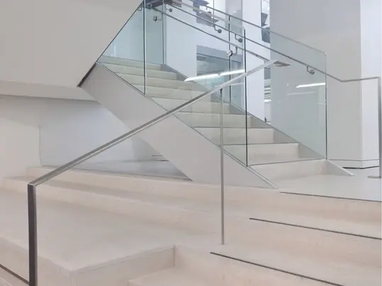
Bloor Gladstone Library is not at all a sculptural piece of architecture. The aim was to make the architecture as minimal as possible; the elements and details, the transitions between materials, and the transparency and neutrality all help to give
the programme a chance to take centre stage. The people become a part of the architectural expression, in the sense that you see a diverse user population engaging with the diverse programmes offered within. Diversity is an important concept,
especially in a multicultural society like Canada. It is represented through the architecture and the users. Our libraries reinforce the perception of diversity."
Besides being neutral, the libraries also have an
austere quality which somehow contrasts with
their openness. Do you agree?
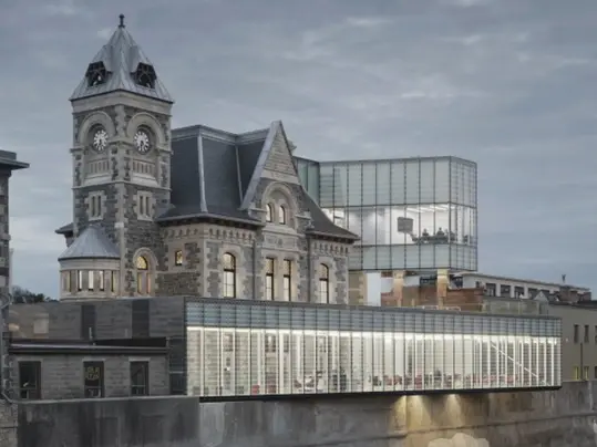
“Perhaps there is a contrast between these two characteristics. For example, the Waterdown “The Idea Exchange Old Post Office project in Cambridge represents a radical idea of a public library that is basically comprised only of creation space. This project was not only technically challenging, but it also required ingenuity to animate spaces that would still feel like a public library even though there were no books. Cambridge is a small city, Southwest of Toronto, that rebranded its public library system as the ‘Idea Exchange’. Across the river from this project there is a traditional central library, filled with books. This proximity meant that the Idea Exchange did not need another conventional library in the neighbourhood. Rather, it created an opportunity to experiment with the notion of a bookless library, set within a renovated heritage post office with a sizeable contemporary glass edition."
Photo: Tom Arban Photography

.webp)
Hamilton central Library and Farmers Market, Hamilton, Canada (2010) Photo: Tom Arban Photography
.webp)
Springdale Library , Brampton, Canada (2019) Photo: Nic Lehoux
As far as digital information is concerned, people no longer need to visit a library. They can get hold of the reading matter just as easily at home. How do you make a bookless library that is so
attractive that people will leave their homes and
will actually go there?
“We have found that when the public libraries that we have designed open, they are typically embraced by the public. In most cases, circulation numbers double or even triple relative to older branches. The public library offers programme and safe community space to a wide spectrum of users, young and old alike. They can engage with new technology such as free Wi-Fi, computer stations,
laptops and tablets – technology that many may not have at home. And of course, people still like to be together. They come to the library to meet and to do things together. In essence, public libraries are community gathering spaces." “This sense of community gathering is at the heart of why we attempt to perceptually showcase public activity throughout our buildings. Our libraries
have been designed to exhibit the people, the programmes and the activities. That is why our libraries have very few walls, low book stacks and
great sight lines, often with interconnected spaces that offer diagonal views to allow people to see up and down within levels. People actively perceive programmes and the technology used within the library. Sometimes the connection is created by sound. The basement of the Idea Exchange has a performance studio, so when people make music together you can hear it on upper levels and feel drawn to watch the performance or to engage with
instruments that are available for use.” Three of the libraries combine old and new: the Bloor Gladstone Library, the Hamilton Central Library and Farmers’ Market, and the Idea Exchange Old Post Office Public Library. How did you deal with the old building when adding a new part to it? “Two of those libraries are listed heritage buildings and the third, the Hamilton Central Library, is a
heavy-handed and rather unattractive piece of brutalist architecture. However, the overall approach has been the same. The starting point is always to honour the existing building by understanding
and analysing its architecture. With listed heritage buildings, the analysis and understanding is critical to the process of convincing authorities that your design approach is sensitive and appropriate."
.webp)
Springdale Library and Komagata Maru Park, Brampton, Canada (2019)
.webp)
Photos: Nic Lehoux
American suburban landscape, adjacent to
suburban housing and a strip mall. In this rather
unappealing context, we started with a flat
suburban site, next to a shallow ravine on one
side and the strip mall on the other. The ravine at
least offered us a limited topography and natural
greenery to respond to. The idea was to bring
spatial interest to the site through the creation of
an organic landscape, and to extend this landscape
into the architecture and urban design for the site.
The resulting project creates an anomalous organic
disruption to the mundane suburban experience.
It has a fluid organic shape in plan and in section,
all the while trying to be as light as possible, to the
point where the architecture almost disappears.”

Is it one of your objectives to reconnect the users
of Springdale Library with nature?
“Absolutely. I wanted to create a work of architecture and a landscape composed using the kinds of organic geometries found in the natural world, and at the same time to blur the boundary between building and landscape. Whether it is the ravine with its curving edge condition, or the low berms and swales that organize the park, or the park shape itself, the focus of the design is to connect experientially with nature. Moving forward, the evolution of a design language for public architecture, and the dichotomy between simplicity and evolving complexity, continue to occupy my mind. The primary focus has become to seek a balance between the quiet and the complex, while striving to produce a clear, legible and powerful public architecture." “In the case of the Bloor Gladstone library that was a real challenge. Heritage Preservation Services at the City of Toronto was very much opposed to the idea of a glass box addition to a masonry structure, and I spent a lot of time convincing them. This was a learning process for me. The analysis helped me to justify how I wanted to approach the building intuitively and to understand why. Part of the process was to document the existing building through drawings and models, so as to understand the historic articulation, the lines of decoration, the building height, the height of the eaves and the
cornice, the division or fenestration patterns, and the base of the existing building. The result of this analysis was abstracted and integrated into the overall contemporary composition of the glazed addition. The addition is a quiet kind of architecture that takes a background role and respectful position, touching the historic building as lightly as possible. And while it is simple, there are many subtle points of articulation that draw reference from the existing building."On one hand, the addition contrasts with the old structure, and distances itself from it as a way to respect it. On the other hand, it is brought closer by making these subtle references. Why? “I like things to be simple. I like things to be pure and legible, reduced to their essence. But I don’t like them to be simplistic. I still want them to have meaning, and typically many layers of meaning. Simplicity is a personal design preference, but I also feel that a quiet design approach calms people who often lead hectic lives; it brings serenity to the streetscape and quietly counteracts the complicated and chaotic urban fabric. However, with each project I learn more and more, and the design language grows, in terms of programme, components, and complexity. So the language struggles to balance simplicity and complexity.”
“The Springdale Library is a simple project in many ways. Its complexity comes from exploring new geometries and systems. The compound curvature of the roof and the fluid interior ceilings are new systems of geometry that I had not previously explored. As a result, I had to figure out how to study, design and build these forms. Making this process even more challenging was the fact that I also had to understand how to integrate these ideas on very tight Canadian budgets. It is too expensive to design custom systems from scratch, so we customized economical off-theshelf products, pushing them to the limits of what is possible using our own design ingenuity. This method has worked to great effect on many of our
projects.” In Springdale Library, architecture becomes nature and nature becomes architecture. Compared to your earlier projects, it is a step forward – even a leap – in the evolution of your architecture. Was there a specific reason to design such a challenging building? “The Springdale Library is set in a typical North"
Photo: Tom Arban Photography
.webp)
Want to read more interviews like this? ArchIdea is our bi-annual magazine that features well known and upcoming architects from all over the world alongside some of the latest projects in which our floor covering has been installed.
To start receiving your FREE copy, sign up here