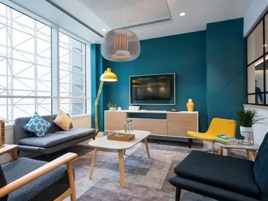
There has been a shift in segment design
Before, there was clear uniformity; a hospital would look like a hospital and an office would be designed to be exactly what you would expect from an office, simply a place to work.
Graduating as a textile designer from the Design Academy, Eindhoven, in the Netherlands, Marijke has worked as an independent designer for several architecture and design studios and also has a longstanding career in teaching at several Dutch Art and Design Academies.
As Senior Designer within the Forbo Design Team, Marijke initiates collaborations with international educational design institutes, independent designers and international furniture manufacturers. In her projects she collaborates with BA and MA students in product and interior design. Being connected with the fresh perspective of young design talent is of great value, helping her her to identify emerging trends and to understand the need for future product innovations.

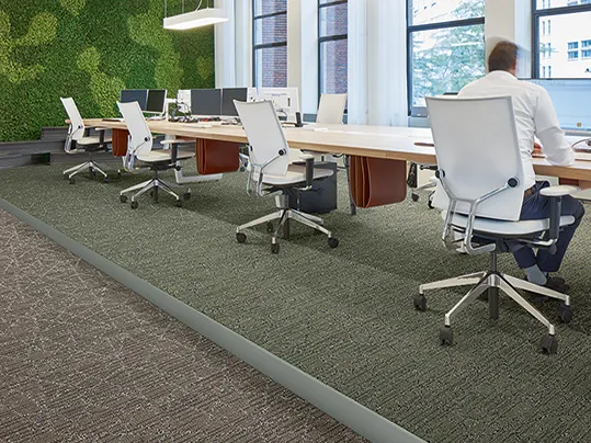
In the contemporary office environment, we are seeing an increased focus on the health and wellbeing of the employee. Modern-day offices now not only provide spaces to work, but they also offer areas to relax and to socialise in – and the flooring plays a significant role in the total experience. In fact, it can help to distinguish different spaces or connect the multifunctional spaces together, all the while being functional, decorative, stimulating or supportive to the other architectural elements, depending on the purpose of the space.
There is also an increase in demand for transitional environments; spaces need to be able to evolve and adapt to new functions. And these constantly changing spaces require walls and floors that can perform as a chameleon, with timeless colours and basic materials.
These trends and changing mindsets inspired the Forbo Design team to develop a Global Colour Card. Instead of defining segment-related colour ranges, the team analysed the different dynamics taking place within a building. The Global Colour Card framework represents the dialogue between the selected colours and the way that they are grouped together to set the tone, rather than the individual colour. As it is the overall expression of the selected colours that represents the defined atmosphere, the individual colors can easily be updated when needed whilst keeping the total feel intact.
Five themes were identified; Receiving, Moving, Connecting, Concentrating and Recharging, with each one referring to the different identities a space can have. The five themes express a certain state of a person or an activity taking place within the building, and each scenario has its own unique colour dialogue with its genuine identity created by the contrast, intensity and the positioning of colours. It is the overall expression of the selected colours that represents the defined atmosphere, with the individual colours being easy to update when needed, whilst keeping the total feel intact.
The theme ‘Receiving’ describes the scenario of a person entering a building; making a transition from the outdoors to the indoors. A space where one should feel welcome and is accessible and transparent as first impressions are key. This is the area of the building that should clearly represent the ‘feel’ of the brand and meet the expectations of the client to make them feel comfortable and at home. A range of natural and neutral colours could provide the base to create a warm and welcoming ambience and at the same time offer a backdrop for strong and outspoken brand identity colours.
‘Moving’ represents the move towards the destination and the purpose of why someone is in a building - getting from A to B, the reception desk to the person you want to meet, or the transition between departments, for example. Orientation is priority, so these areas need to be clear to read and offer guidance even when one is stressed. The space needs to be legible for instance this can be done with bright colours which can be applied in contrasts as well as for the use of signs and symbols to aid with wayfinding.
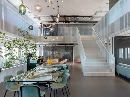
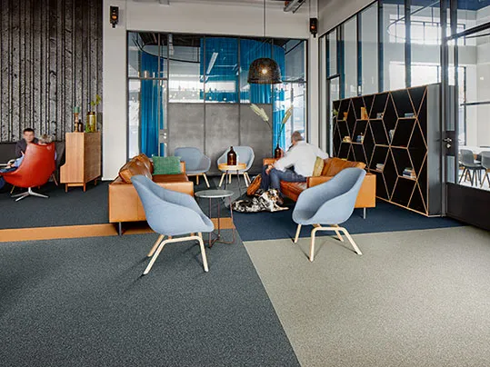
The dynamics of a ‘Connecting’ space signifies areas where you will connect with other people within a building, such as open public spaces for spontaneous interactions or semi open spaces for dialogues or brainstorms. These areas allow for an extrovert energy boost or to give the brain time out. Here, colours and materials can be more complicated, such as layered colour schemes with unexpected combinations, to spark interest and curiosity and to inspire thoughts.
For ‘Concentrating’, the attention is on the individual and avoiding unwelcome distractions. These are secluded spaces for privacy and focus and while concentrating, people need a muted ambiance and good acoustic properties. Therefore, colour palettes in this area of a building should be subtle and quiet with minimal textures, or saturated, matte, warm, soft and neutral for the senses.
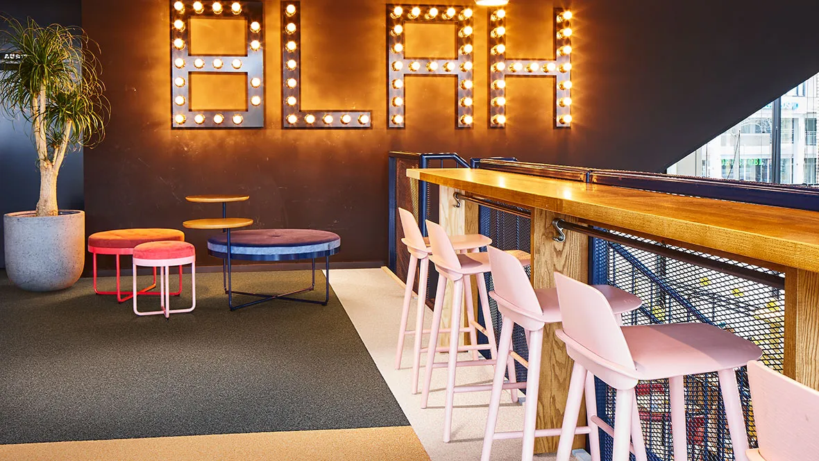
Lastly, ‘Recharging’ is connected to mindfulness and describes relaxed environments where people can let their guard down and be themselves. This area of the building should reflect a home-like setting, to allow for people to refresh and recharge, and to enable a feeling of temporary ownership. Light and fresh shades should be used here, such as pastel colours, as they are weightless and crisp, encouraging people to take a break, breathe and escape.
Using this concept of a colour card based on the various dynamics taking place in a building with its different requirements, enables Forbo to create a complete product portfolio that connects seamlessly. With this approach we are able to offer the possibility to integrate a variety of our flooring products in a beautiful way and ensure that the floor will contribute to creating a positive experience
