May 2016 issue
Look twice and wonder
The ‘classic’ straight forward product design already for years seems to be neglected. Replaced by demonstrations of material experiments, works in progress or elaborate descriptions of the concept behind the product. Often leaving the viewer puzzled and confused.
This year these ‘unfinished’ fragments seem to have evolved into something new. Matured into tangible and poetic objects. Advanced Relics as they are called in the Dutch Invertuals exhibition.
Rich in material expression and with the perfect level of abstraction they seduce and trigger the imagination. Like a contemporary ‘Wunderkammer’ for the designer.
The Envision and the Nike presentation are two wonderful examples of this development. To refer to what the studio TrulyTruly stressed in an interview, my advice to you when reading this newsletter is to linger and to ‘Look twice and wonder’
Arper
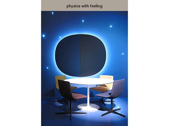
physics with feeling- ‘’...what lifts a color beyond the plane of physics to the realm of experience? Is it the careful creation of harmonies, the interplay of the color and material?
Grey metal can sing. The same grey tone in a textile may whisper. A rich, red berry is appetising, vibrant, red velvet curtain invokes anticipation and drama.
Color stimulates beyond sensory perception. It evokes emotion...’’ (excerpt from Arper quote)
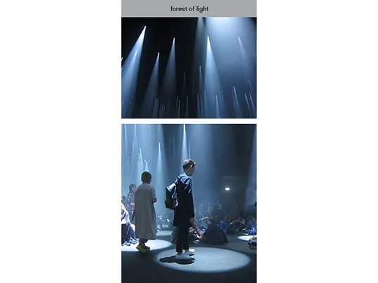
COS
forest of light- Sou Fujimoto Architects designed for COS a multi-sensory installation. Inspired by the experience of a forest at twilight.
A darkened space is illuminated by cones of light that are designed to respond to visitors’ movements. With fog, specially-composed sounds and mirrored walls an immersive environment is created in which the pressure of time seems to evaporate.
Écal
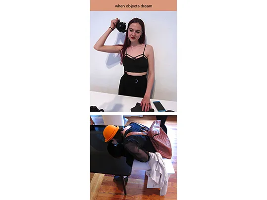
when objects dream- media and interaction design students of the Swiss university Écal were asked to imagine objects having their own dreams and personalities.
Using connected technologies and virtual reality possible future versions of everyday objects were designed. This series of interactive objects created very entertaining effect during the exhibition.
An example is a teapot which pours a "liquid sound" into visitors' ears when tilted. A concept by Salomé Chatriot.
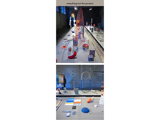
Envisions
beautiful objects- Envisions is a group exhibition that showcases everything but the end product. Different phases of the design research process are translated into beautiful and inspiring objects.
The neutral grey furniture linoleum creates a perfect background to experience these precious works.
Look twice and wonder!
Nike
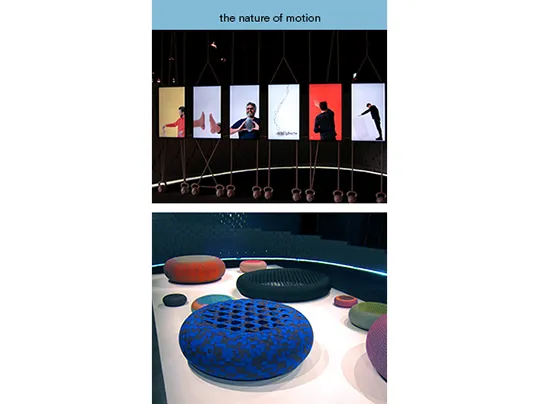
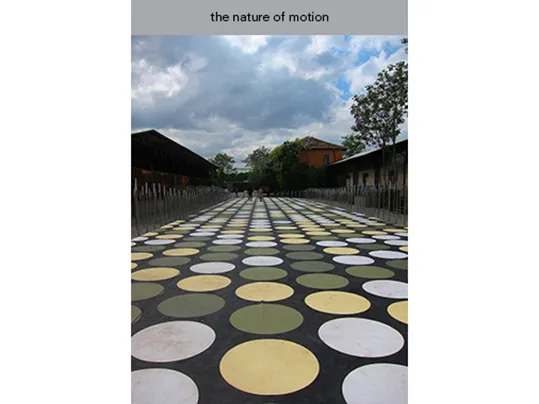
the nature of motion- for the Milano Design Week 10 designers were invited by Nike to explore 'natural motion' through various mediums.
In many cases, materials unique to Nike, such as Flyknit, have been applied.
Bertjan Pot designed a series of resting pods using the wheel as starting point. Upholstering the inner tube of a car with ropes, Nike laces and belts. Creating a lightweight construction with minimal material.
Nike
Martino Gamper focussed with his designs on rhythm and sound. Three different drum kits were made. Nike Flyknit material was used to create the drum skins and Marmoleum to upholster the cilinders.
Studio van der Scheer
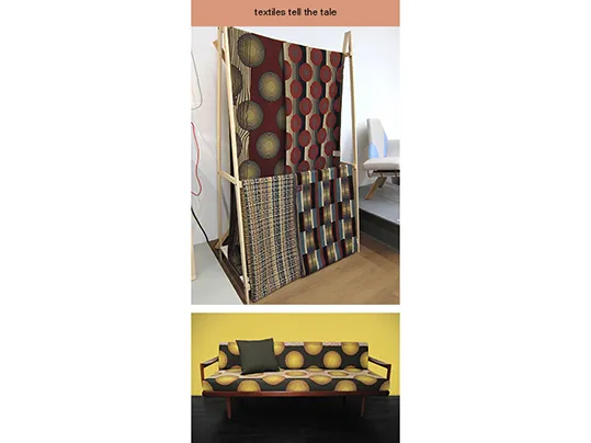
textiles tell the tale- the narrative and expressive characteristics of Vlisco fabrics are translated into a collection of seven different jacquard woven upholstery patterns. Presented in the Masterly exhibition during the Milan Design week.
Artek
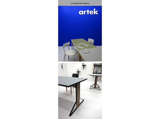
an attractive patina- ‘Kaari’ is a modernistic furniture collection designed by the Bouroullec brothers for Artek.
The design challenge was to create a product both suited to Artek and simultaneously new. Avoiding explicit references to historic Artek products.
Kaari is based on an outline of a triangle. The diagonal steel line supports the table leg in a variety of compositions.
Furniture linoleum and glossy HPL which are chosen as surface materials absorb or reflect light in different ways. As the tables are used over the course of time, these materials will develop an attractive patina.
Torsson Husabo
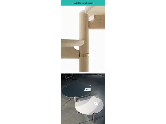
readable construction- in this design wood is used as structural and as visual element. The different structures and nuances in the Maple wood is applied in a clear readable design.
Two different furniture linoleum colours are used for the tabletops.
All the way to Paris
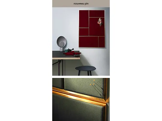
nouveau pin- a pin board designed as a flexible module system in three sizes with which one can create as big a pin board surface as needed.
Alessandro Mendini
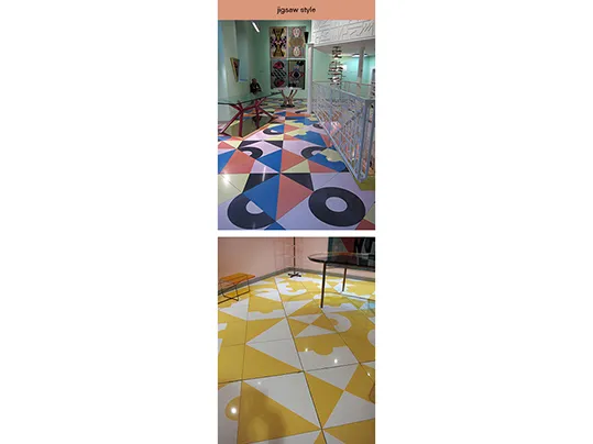
jigsaw- oversized brightly coloured playful jigsaw style floor pattern design by Alessandro Mendini for the Fragile Gallery in Milano.
Design Soil
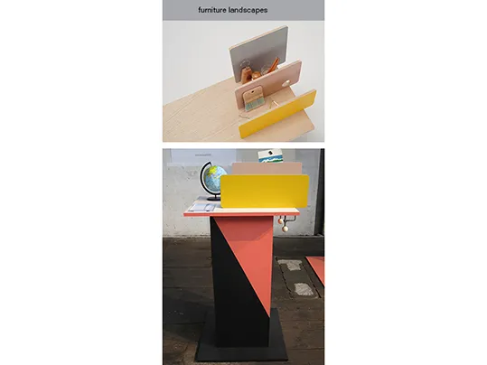
furniture landscape- Design Soil is a design project of Kobe Design University
In the presentation “Geography” a new perspective on the relationship between furniture and its surroundings is offered. Compositions of furniture are presented as a landscape that guides our daily rituals.
‘Space’ by Misato Nakamura. Small panels on a table top are creating new space for objects that have nowhere to go. The different panel sizes allow to show or hide these objects at one's will.
Dare to Rug
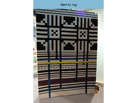
contemporary traditions- Romanian Designers Andreea Batros and Flavia Scînteanu blend the traditional rug making process with contemporary design and high quality materials.
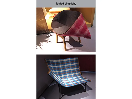
Moroso
folded simplicity- Kenny Chair features a simple pocket-like textile seat which is attached to an oak frame. A rectangle fabric is folded into a curvaceous shape to create something very comfortable.
Kenny chair by Raw Edges and Paper Planes by Doshi & Levien.
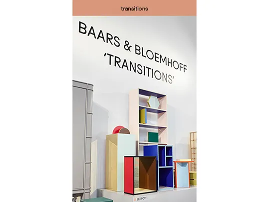
Baars & Bloemhof
transition- Six Dutch designers were challenged to make an unorthodox, out of the box design based on a by them selected material from the Baars & Bloemhof assortment.
Kvadrat
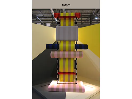
loom- a landmark shown in the Salone del Mobile Satelliti hall. Designed by Patricia Urquiola for Kvadrat with Kvadrat fabrics.
Catalan de Ocon & Faccin
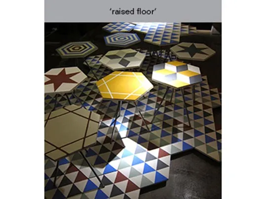
'raised floor'- the riad table is based on the traditional manufacturing process and graphic motifs of concrete floor tiles which emerged in Mediterranean Europe in the early 20th century as an industrial response to old mosaic floors.
Designed by Alvaro Catalan de Ocon & Francesco Faccin
Mieke Meijer
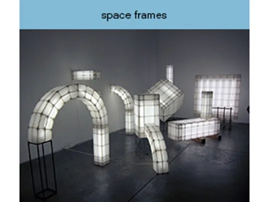
space frames- the abstract volumes are based on archetypical architectural elements and made from lightweight wooden structures enclosed by a stretched textile cover.
The arrangements of the separate objects create an interaction with the surrounding space, making the negative and positive space equally important.
Should you want to receive our TRNDS newsletter on a regular basis please subscribe here
Subscribe for TRNDS newsletter
